Bootstrap vertical navbar
In this tutorial, we'll build a fixed Bootstrap sidebar using Bootstrap vertical navigation and media objects.
The reason why I like this approach is that it's easy to implement and it looks great on any device size.
Vertical Navigation in Web Design
Vertical navigation is an intuitive and easy way to navigate your website. It allows you to present information in a hierarchical way, which makes it easy for users to find what they are looking for.
Vertical navigation is usually used on larger websites where the content is divided into multiple categories or sections. The most common example of vertical navigation on the web is the site home page.
Vertical navigation bars have been around since the early days of web design (they were actually one of the first things that people started using on their websites). However, many designers have abandoned them in favor of horizontal menus or other types of navigational aids (such as drop-down menus). One reason for this is that vertical navigation bars are usually very large, which makes them difficult to fit onto small-screen devices such as phones and tablets. Another reason is that some users think they're ugly or outdated — even though they've been around since the beginning of the web!
When to use the vertical navigation
The vertical navigation pattern is usually used when the page is relatively narrow or has a lot of content. It is a common pattern used in the footer, sidebar, or any other place where space is limited.
It can be used for secondary navigation, but it can also be used for the main navigation if there are too many items in your navigation menu.
When to use the vertical navigation:
-
To allow users to jump directly to a specific section of your site
-
To allow users to jump directly to a search bar (or any other page)
-
To give people an overview of what's on your site before they dig into specific pages or products
When not to use the vertical navigation
A vertical nav bar is a great alternative for websites that need to display a lot of content. However, there are some cases where you should avoid using it.
If your site has a lot of pages and you want to make sure users can find what they're looking for, then you should consider having a horizontal navigation bar.
Vertical navigation is also not recommended if you have many different categories or sections on your website (for example sports equipment). In this case, having a horizontal menu makes it easier for users to quickly find what they are looking for.
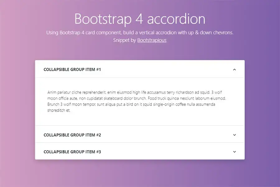
If you liked this snippet, you might also enjoy exploring Bootstrap Accordion with chevron up + down or Bootstrap Split-Screen Login Page .


