Bootstrap navbar with logo
In today's Bootstrap snippet tutorial, I will show you how to create a Bootstrap 4 (Bootstrap 5) navbar with an image logo.
Let's get started!
What is Boostrap navbar?
The Bootstrap Navbar is a horizontal navigation component that can be used in web pages and web applications. The Bootstrap navbar is responsive, meaning it will adapt to different screen sizes and device resolutions.
It consists of links and buttons that when clicked navigate to different pages of the website. It can also contain forms, icons, dropdowns, and much more.
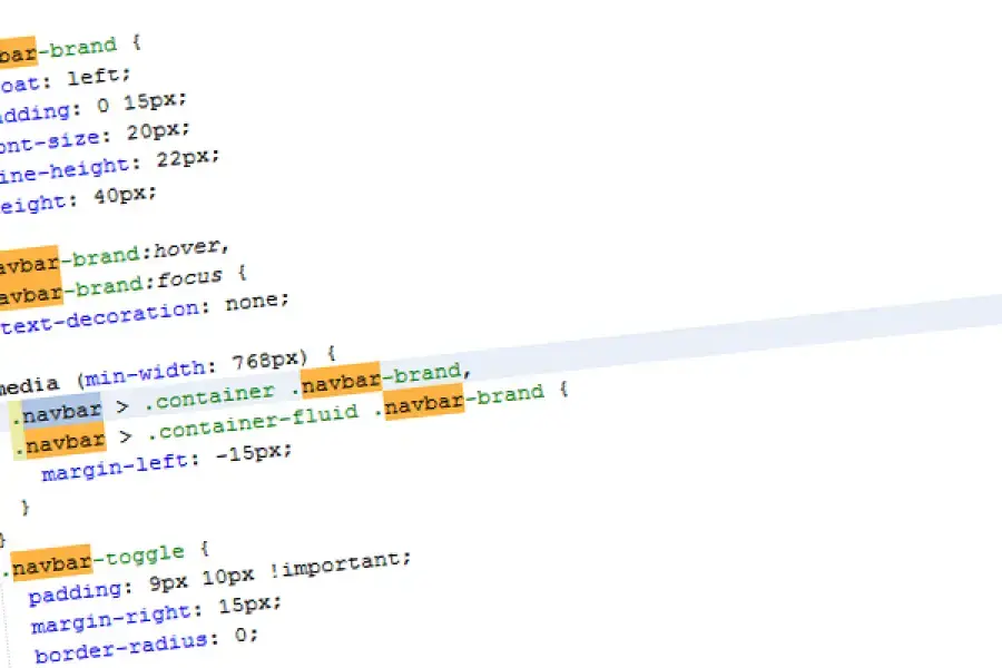
How to add a logo to Bootstrap navbar - Step-by-step instructions
- Add your logo image inside
a.navbar-brand - You can set the logo size by
width="",height=""attributes. I usually set the height to 30-40px and calculate the width based on your image proportions. - If needed, add one of the
.align-top .align-middle .align-bottomclasses to vertically align the adjacent text with the image. - Optional: add additional padding to the Navbar Brand by Bootstrap utility classes - e.g.
.py-1 - Optional: Use SVG image format for your image logo.
These instructions also apply to Bootstrap 3 or Bootstrap 5 without the need for any major changes.
Why is responsive navigation important in web design?
When it comes to web design, responsive navigation is one of the most important elements of your website. The reason for this is that there are so many different devices that people use to access websites.
For example, there are people using desktop computers, laptops, and tablets. The same applies when you go mobile too. There are people using smartphones and phablets.
This means that you need to design your navigation in such a way that it will work well on all these devices and in all different resolutions without any problems.
This is why many designers use similar things like Bootstrap Navbar with Logo as a way to create their responsive navigation bars quickly and easily.
If you liked this snippet, you might also enjoy exploring Bootstrap Pricing Table or Bootstrap Team Page .