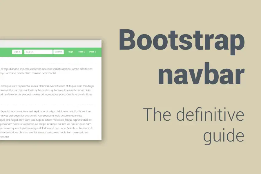
Today I'd like to show you how to create a bootstrap navbar, adjust it to your needs and tweak its behaviour.
In this tutorial and guide, we will explore in detail all the navbar components and how to properly use
At the end of the article, we will also use some CSS and jQuery tricks to enhance the basic navbar structure and apply some advanced tweaks to our navbar to enhance the user experience on your website.
Structure of this Guide
- Basic Files
- HTML Structure
- Navbar Components
- 4. Navbar Utilities
- 5.Common problems that you could face while working with navbars
- 6.Advanced Tricks
Basic Files
Let's set up our basic environment before we start. We'll need both Bootstrap CSS and JS files and the jQuery Library, that's it.
You should have the following lines ready before we get our hands dirty:
<!DOCTYPE html>
<html>
    <head>
        <meta charset="utf-8">
        <meta name="viewport" content="width=device-width, initial-scale=1.0">
        <meta http-equiv="X-UA-Compatible" content="IE=edge">

        <title>Bootstrap Navbar Tutorial</title>

         <!-- Bootstrap CSS CDN -->
        <link rel="stylesheet" href="https://maxcdn.bootstrapcdn.com/bootstrap/3.3.7/css/bootstrap.min.css">
        <!-- Our Custom CSS -->
        <link rel="stylesheet" href="style.css">
    </head>
    <body>


        <!-- jQuery CDN -->
         <script src="https://code.jquery.com/jquery-1.12.0.min.js"></script>
         <!-- Bootstrap Js CDN -->
         <script src="https://maxcdn.bootstrapcdn.com/bootstrap/3.3.7/js/bootstrap.min.js"></script>
    </body>
</html>
HTML Structure
Let's first discuss the structure of the navbar element, piece by piece, and explain what does every component exactly do.
If you open the Bootstrap Navbar Documentation you will see a code similar to this one:
<nav class="navbar navbar-default navbar-fixed-top">
    <!-- Navbar Container -->
    <div class="container">

        <!-- Navbar Header [contains both toggle button and navbar brand] -->
        <div class="navbar-header">
            <!-- Toggle Button [handles opening navbar components on mobile screens]-->
            <button type="button" class="navbar-toggle collapsed" data-toggle="collapse" data-target="#exampleNavComponents" aria-expanded"false">
                <i class="glyphicon glyphicon-align-center"></i>
            </button>

            <!-- Navbar Brand -->
            <a href="#" class="navbar-brand">
                Bootstrap Navbar
            </a>
        </div>


        <!-- Navbar Collapse [contains navbar components such as navbar menu and forms ] -->
        <div class="collapse navbar-collapse" id="exampleNavComponents">

            <!-- Navbar Menu -->
            <ul class="nav navbar-nav navbar-right">
                <li class="active">
                    <a href="#">Page 1</a>
                </li>
                <li>
                    <a href="#">Page 2</a>
                </li>
                <li>
                    <a href="#">Page 3</a>
                </li>
                <!-- Navbar link with a dropdown menu -->
                <li class="dropdown">
                    <a href="#" class="dropdown-toggle" data-toggle="dropdown" role="button" aria-haspopup="true" aria-expanded="false">Dropdown
                        <span class="caret"></span>
                    </a>
                    <ul class="dropdown-menu">
                        <li><a href="#">Action</a></li>
                        <li><a href="#">Another action</a></li>
                        <li><a href="#">Something else here</a></li>
                        <li><a href="#">Separated link</a></li>
                        <li><a href="#">One more separated link</a></li>
                    </ul>
                </li>
            </ul>

            <!-- Navbar Form -->
            <form action="#" class="navbar-form">
                <div class="form-group">
                    <input type="text" class="form-control" placeholder="Search">
                </div>
                <button type="submit" class="btn btn-default">Submit</button>
            </form>

            <!-- Navbar Button -->
            <button type="button" class="btn btn-default navbar-btn navbar-right">Sign in</button>

            <!-- Navbar Text -->
             <p class="navbar-text">Signed in as Mark Otto</p>

        </div>
    </div>
</nav>
What is navbar?
Navbars are responsive meta components that serve as navigation headers for your application or site. They begin collapsed (and are toggleable) on mobile devices and become horizontal blocks as the available viewport width increases.
To make your navbar accessible be sure to use <nav> element for the navbar parent element. If you prefer to use a generic element such as <div>, add a role="navigation" to every navbar too. That's due to identifying it as a landmark region for users of assistive technologies.
Navbar Components:
Bootstrap's navbar consists of 3 main components which are:
Bootstrap also provides some helper utilities, we will have a look at them as well.
1. Navbar Container
Bootstrap navbar uses .container-fluid by default, it should be included right behing the parent element (nav.navbar) and wrap all navbar contents.
You have the freedom to use .container-fluid or .container div, it depends on the width you need, no limitations.
2. Navbar Header
.navbar-header is the second one main components of the navbar. It wraps both navbar brand and navbar toggle button and renders them properly.
Let's see what navbar brand and navbar toggle button do.
2.1 Navbar Brand
.navbar-brand is the piece that represents the brand of yours. It's a place where you place your logo or a brand name.
Whether it's a text like this:
<!-- Navbar Brand [with text]-->
<a href="#" class="navbar-brand">
    My Awesome Logo
</a>
Or an image like this:
<!-- Navbar Brand [with image]-->
<a href="#" class="navbar-brand">
    <img src="logo.png" alt="brand">
</a>
2.2 Navbar Toggle Button
This button handles collapsing the navbar content on mobile screens. Whatever you put in your navbar (except navbar brand) will be hidden by default on mobile screens. This toggle button will bring them back to you when you click it.
In simple words, when you transfer to a mobile screen, the only visible pieces will be the navbar brand and the toggle button. When you click the toggle button, the other stuff appears.
The button itself is hidden on larger screens. By default, it's hidden on screens larger than 768px. You can change this value, we'll discuss this later on.
Let's explain the structure:
<!-- Toggle Button [handles opening navbar components on mobile screens]-->
<button type="button" class="navbar-toggle collapsed" data-toggle="collapse" data-target="#exampleNavComponents" aria-expanded"false">
    <i class="glyphicon glyphicon-align-center"></i>
</button>
Attributes of the navbar toggle button
- The button is defined by the two classes
.navbar-toggle.collapsed. - Be sure to add
data-toggle="collapse",this attribute tells JavaScript that this it controls the collapsing behaviour. - The previous data-toggle attribute needs to be accompanied with its target. The
data-target=""should contain on theidof the box wrapping the hidden components. So if you'll wrap your components in a box withid="example", then data-target of the button should bedata-target="#example". - Next, the
aria-expanded=""attribute defines the initial state of the hidden components. If it'sfalsethat means it's hidden, iftrueit's visible.
The content of the button is up to you. You can use glyph icon for example, or an icon accompanied by the text, e.g. "Menu". In this case, we just used a bars glyph icon.

3. Navbar Collapse
The navbar collapse is the component which wraps the remain components of the navbar, such as navbar menu, navbar buttons, forms... etc. In other words, it wraps all navbar components except .navbar-header.
It's defined by the two classes .collapse navbar-collapse. This box should have an id, this id must be identical to the toggle button data-target="" value.
Contrary to the navbar toggle button, navbar collapse is visible by default on larger screens and hidden on smaller ones. On smaller screens, it is switched from hidden to visible and vice versa by clicking navbar toggle button.
Now, let's explore the navbar collapse's components.
3.1. Navbar Menu
<!-- Navbar Menu -->
<ul class="nav navbar-nav">
    <li class="active">
        <a href="#">Page 1</a>
    </li>
    <li>
        <a href="#">Page 2</a>
    </li>
    <li>
        <a href="#">Page 3</a>
    </li>
    <!-- Navbar link with a dropdown menu -->
    <li class="dropdown">
        <a href="#" class="dropdown-toggle" data-toggle="dropdown" role="button" aria-haspopup="true" aria-expanded="false">Dropdown
            <span class="caret"></span>
        </a>
        <ul class="dropdown-menu">
            <li><a href="#">Action</a></li>
            <li><a href="#">Another action</a></li>
            <li><a href="#">Something else here</a></li>
            <li><a href="#">Separated link</a></li>
            <li><a href="#">One more separated link</a></li>
        </ul>
    </li>
</ul>
Navbar Menu is the element that wraps the navbar links. It is an ul defined by the two classes: .nav navbar-nav.
One of its li children should have an .active class to mark that it is the link to the current page.
You can also include dropdowns inside the navbar menu. To include a dropdown, you should follow the structure as shown below.
<!-- Link with a dropdown menu -->
<li class="dropdown">
    <a href="#" class="dropdown-toggle" data-toggle="dropdown" role="button" aria-haspopup="true" aria-expanded="false">Dropdown
        <span class="caret"></span>
    </a>
    <ul class="dropdown-menu">
        <li><a href="#">Action</a></li>
        <li><a href="#">Another action</a></li>
        <li><a href="#">Something else here</a></li>
        <li><a href="#">Separated link</a></li>
        <li><a href="#">One more separated link</a></li>
    </ul>
</li>
Bootstrap dropdowns in a navbar
- The
<li>that contains the dropdown should have the class.dropdown - Its direct child
<a>is the element responsible for toggling the dropdown. It's defined by the class.dropdown-toggle. - The
aria-haspopup="true"indicates that the element has a popup context menu or sub-level menu. It notifies screen reader users that a 'Popup' is attached. - The
aria-expanded=""as we mentioned before, defines the initial state of the dropdown. If it is set tofalsethat it means it's hidden. If set totrue, it's visible. - Be sure to add
data-toggle="dropdown", this attribute is relied on for closing dropdown menus at an application level, so it's a good idea to always use it. Regardless of whether you call your dropdown via JavaScript or instead use the data-api,data-toggle="dropdown"is always required to be present on the dropdown's trigger element. - The child
<ul>is the toggled dropdown itself, and defined with the class.dropdown-menu.
3.2. Navbar Forms
<!-- Navbar Form -->
<form action="#" class="navbar-form">
    <div class="form-group">
        <label for="search-input" class="sr-only">search</label>
        <input type="text" id="search-input" class="form-control" placeholder="Search">
    </div>
    <button type="submit" class="btn btn-default">Submit</button>
</form>
The second component you can use inside navbar collapse is a form. Use the forms with .navbar-form class for proper vertical alignment and collapsed behavior in narrow viewports.
As a heads up, .navbar-form shares much of its code with .form-inline.
It's advised to use labels for every input. Screen readers will have trouble with your forms if you don't include a label for every input. You can hide the labels using the .sr-only class.
If no labels are present, screen readers may resort to using the placeholder attribute. If present, but note that use of placeholder as a replacement for other labeling methods is not advised.
3.3. Navbar Buttons
<!-- Navbar Button -->
<button type="button" class="btn btn-default navbar-btn navbar-right">Sign in</button>
You can also add buttons to the navbar collapse by adding class .navbar-btn to <button> elements not residing in a <form>. This will center them vertically in the navbar.
Like the standard button classes, .navbar-btn can be used on <a> and <input> elements. However, neither .navbar-btn nor the standard button classes should be used on <a> elements within .navbar-nav.
3.4. Navbar Text
<!-- Navbar Text -->
<p class="navbar-text">Signed in as Mark Otto</p>
Also, you can add texts to your navbar in any element with class .navbar-text. It is usually used on a <p> tag for proper leading and color.
4. Navbar Utilities
Bootstrap provides some premade classes that control alignment and the positioning of navbar and its components.
4.1. Navbar Positioning
Fixed to top
If you add .navbar-fixed-top class to the navbar's parent element <nav>, your navbar will become fixed to the top of the viewport.
<nav class="navbar navbar-fixed-top">
    <!-- Navbar Container -->
    <div class="container">

    </div>
</nav>
Fixed to bottom
In case you need your navbar to be fixed at the bottom of the page, similarly add .navbar-fixed-bottom class to the navbar parent element <nav>.
<nav class="navbar navbar-fixed-bottom">
    <!-- Navbar Container -->
    <div class="container">

    </div>
</nav>
Note that the fixed navbar will overlay your other content, unless you add padding to the <body>. The padding value should be equal or bigger than the navbar height, by default, the navbar height is 50px.
So, if you use .navbar-fixed-top for your navbar, make sure to use the snippet below:
body {
    padding-top: 50px; // This value depends on the height of your navbar.
}
If you will use .navbar-fixed-bottom, you should include the padding to the bottom of the body.
body {
    padding-bottom: 50px; // This value depends on the height of your navbar.
}
4.2. Components Alignments
Align nav links, forms, buttons, or text using the .navbar-left or .navbar-right utility classes. Both classes will add a CSS float in the specified direction.
For example, to align nav form to the right side, just add the class .navbar-right to it.
<!-- Navbar Form [at the right side]-->
<form action="#" class="navbar-form navbar-right">
    ...
</form>
Bootstrap 3 has some limitations with .navbar-right. They use a negative margin on the last .navbar-right element. So if there are multiple elements using that class, these margins don't work as expected.
4.3. Navbar Themes
There are two ready-made versions of the navbar. The default one is light, and the other one is dark.
To use the light version of the navbar, simply add a navbar-default class to your navbar.
<!-- Light version -->
<nav class="navbar navbar-default">
    ...
<nav> 
If you want to use the dark version instead, add the class .navbar-inverse to your navbar.
<!-- Dark version -->
<nav class="navbar navbar-inverse">
    ...
<nav> 
5.Common problems that you could face while working with navbars
5.1 The brand image is not vertically aligned properly.
.navbar-brand has its own padding and height. It works without any troubles with texts. However, if you decide to use <img> instead, you'll need to make a small CSS tweak to fix the issue of vertical alignment of that image.
All you have to do is to remove the padding from .navbar-brand and give it to the <img> inside it. Also make the <img> 100% height. See the snippet below:
// reset the default navbar brand padding [it's 15px by default] .navbar-brand {
    padding: 0;
}

// transfer the navbar brand padding to the image inside it, also make it 100% height .navbar-brand >img {
    padding: 15px;  // this value is optional, increasing or decreasing it is up to you.
    height: 100%;
}
5.2. Overflowing content
Sometimes, your navbar is not wide enough to take all the content you insert. Since Bootstrap doesn't know how much space the content in your navbar needs, you might run into issues with content wrapping into a second row.
To resolve this, you can:
- Reduce the number or width of navbar items.
- Hide certain navbar items at certain screen sizes using responsive utility classes.
- Change the point at which your navbar switches between collapsed and horizontal mode by using a media query.
If you use a preprocessor like LESS, adjust the variable @grid-float-breakpoint in the LESS source with the breakpoint you need. The default value is 768px. If you directly deal with CSS, you can do this with media query.
@media (max-width: 991px) { // The value of 991px is just a random value, you can change it according to your content. .navbar-header {
        float: none;
    }
    .navbar-toggle {
        display: block;
    }
    .navbar-collapse {
        border-top: 1px solid transparent;
        box-shadow: inset 0 1px 0 rgba(255,255,255,0.1);
        overflow: hidden !important;
    }
    .navbar-collapse.collapse {
        display: none!important;
    }
    .navbar-collapse.collapse.in {
        display: block!important;
    }
    .navbar-collapse *[class*='navbar-'] {
        float: none!important;
        margin: 7.5px -15px;
    }
    .navbar-nav > li {
        float: none;
    }
    .navbar-nav > li > a {
        padding-top: 10px;
        padding-bottom: 10px;
    }
}
Let's see an example of the navbar that collapses at 991px instead of 768px See Demo
5.3. Changing navbar's height
It's not a good idea to set a hard value for your navbar height. That will cause some troubles whether in the vertical alignment or in rendering content on mobile screens.
It's advised to use vertical padding instead. But, if you had to do this, make sure you did it on viewports wider than the collapsing breakpoint to avoid issues on mobile viewports.
If your navbar collapsing breakpoint is e.g. 768px, make sure your code will be added inside this media query:
@media (min-width: 768px) {
     // your code goes here
}
5.3.1. Using flexbox
To fix the vertical alignment issue after you set a custom height easily, you can take advantage of using the flex property. Give your navbar display: flex with align-items: center. This should fix it any formatting problems for viewports above the navbar collapsing breakpoint you could be experiencing.
To change its height also below the collapsing breakpoint, you have to style individual elements, unfortunately, as show below.
See the snippet below:
@media (min-width: 768px) {
     .navbar {
         height: 80px; // your custom height
         display: flex;
         align-items: center;
     }
}
@media (max-width: 767px) {
    .navbar-header {
        height: 80px;
        padding-top: 15px;
        padding-bottom: 15px;
    }
    .navbar-toggle {
        margin-top: 5px;
    }
}
Let's have a look at a demo with our navbar. See Demo
5.3.2. Setting new heights and paddings
Let's suppose again that you need to increase the navbar's height to 80px.
Another way to way to modify your navbar's height consists of this steps:
- Define height or min-height for few elements:
.navbar,.navbar-brand - Change
margin-topfor the.navbar-togglebutton that appears in the collapsed navbar. This needs to be calculated but it should be easy to do. A formula is in the code. - Change padding-top and padding-bottom and define line-height for uncollapsed navbar links. Values for padding again need to be calculated as you can see in the code below.
.navbar {
    min-height: 80px;
}

.navbar-brand {
    padding: 0 15px;
    height: 80px;
    line-height: 80px;
}

.navbar-toggle {
    /* (80px - button height 34px) / 2 = 23px */
    margin-top: 23px;
    padding: 9px 10px !important;
}

@media (min-width: 768px) {
    .navbar-nav > li > a {
        /* (80px - line-height of 27px) / 2 = 26.5px */
        padding-top: 26.5px;
        padding-bottom: 26.5px;
        line-height: 27px;
    }
}
Let's see the result of this approach. See Demo
If you are using {LESS} files, there is also an elegant way how to increase or decrease Bootstrap's navbar height using {LESS}.
6.Advanced Tricks
6.1. Decreasing a fixed navbar's height after scroll

You might have a fixed navbar with a particular height. But you might need only a compressed version of your navbar to save some viewport space when the user starts scrolling down through the page.
We can make easily achieve that with some CSS and jQuery.
We'll use jQuery event scroll() to achieve that.
When the user starts to scroll down, we will add some extra CSS to the navbar. This extra CSS will be removed again when the user returns to the top of the page.
Let's assume that this is the initial style of the navbar:
 .navbar {
    padding-top: 30px;
    padding-bottom: 30px;
    transition: all 0.5s;
 }
To get the shrinking behaviour, we will just need to reduce the vertical padding when the user starts scrolling down. When the user returns back to the top of the page, we will reset it to its initial value .
$(document).ready(function () {

    $(window).on('scroll', function () {
        if ($(window).scrollTop() >= 20) { // use any value lower than the navbar height, [20] is an example

            $('.navbar').css({ // reducing the vertical padding from 25px to 10px
                'padding-top': '10px',
                'padding-bottom': '10px'
            });

        } else {

            $('.navbar').css({ // reset the vertical padding to its initial value [25px]
                'padding-top': '25px',
                'padding-bottom': '25px'
            });

        }
    });

});
This is the very simple way of using the idea and you can do much more using this approach. It could be changing the background colour of the navbar, adding some box shadow, borders, etc.
Also, instead of injecting the new CSS styles with jQuery's css() function, we can place all your new styles into a class and toggle this class on the navbar based on scrolling. This approach is generally better and cleaner way to do it.
For example, let's save our styling to a class .compressed:
.navbar { // the initial style of the navbar
    padding-top: 25px;
    padding-bottom: 25px;
    background: #333;
    color: #333;
    transition: all 0.3s;
}
.navbar a {
    color: #fff !important;
}

.navbar button {
    color: inherit !important;
}

.navbar.compressed { // the styles that overrides the initial style when the user scroll down
    padding-top: 10px;
    padding-bottom: 10px;
    background: #6dcc7c;
    color: #6dcc7c;
    box-shadow: 2px 2px 2px rgba(0, 0, 0, 0.1);
}
Then we toggle this class to the navbar with jQuery addClass() and removeClass() functions:
$(document).ready(function () {

    $(window).on('scroll', function () {
        if ($(window).scrollTop() >= 20) {
            $('.navbar').addClass('compressed');
        } else {
            $('.navbar').removeClass('compressed');
        }
    });

});
This is it, let's see the result of our work. See Demo
6.2. Affixing navbar after scroll, sticky navbar

Let's suppose our page contains a navbar that is not on the top of the page, e.g. below some intro image. We want to affix this navbar fixed to the top when the user scrolls past it.
This approach could be easily achieved by using jQuery.
The idea here is to calculate the distance from the top of the page to the original position of the navbar with jQuery function offset().top.
When the user scrolls down through the page by a value equal or bigger than this distance, the navbar becomes sticky and fixes itself to the top. This is done by adding class .navbar-fixed-top to the navbar when it reaches this point.
Let's have a look at our code:
$(document).ready(function () {

     // Calculating the distance from the top of the page to the initial position of the navbar, and store it in a variable
    var navbarOffset = $('.navbar').offset().top;

    $(window).on('scroll', function () {

        if ( $(window).scrollTop() >= navOffset ) { // if the navbar offset equal or bigger than user scrolling, make it fixed
            $('.navbar').addClass('navbar-fixed-top');

        } else {// if not, return it to its initial state
            $('.navbar').removeClass('navbar-fixed-top');
        }

    });

});
As we mentioned before, the fixed navbar will overflow your other content. So you'll notice that the content jumps to top at the moment the navbar becomes fixed.
To avoid that, we should give to the body padding-top value equal or larger than the navbar height.
To achieve this with jQuery, we'll need to calculate the height of our navbar with outerHeight() function. Then, we will use this value as a padding-top value for the <body>.
$(document).ready(function () {

     // Calculating the distance from the top of the page to the initial position of the navbar, and store it in a variable
    var navbarOffest = $('.navbar').offset().top;

    // Calculating the navbar height, and store it in a variable
    var navbarHeight = $('.navbar').outerHeight();

    $(window).on('scroll', function () {

        if ( $(window).scrollTop() >= navOffset ) { // if the navbar offset equal or bigger than user scrolling, make it fixed
            $('.navbar').addClass('navbar-fixed-top');
            $('body').css('padding-top', navbarHeight + 'px');

        } else {// if not, return it to its initial state
            $('.navbar').removeClass('navbar-fixed-top');
            ('body').css('padding-top', '0');
        }

    });

});
Now, let's see what we made See Demo
6.3. Use a mega menu with the navbar.
You can easily use a mega menu for your navbar, the easiest way to do this by using Yamm Mega Menu For Bootstrap 3.
3.1. Installation:
To set up the Yamm mega menu, you need to put the following snippets to your files:
CSS
.yamm .nav, .yamm .collapse, .yamm .dropup, .yamm .dropdown {
    position: static;
}
.yamm .container {
    position: relative;
}
.yamm .dropdown-menu {
    left: auto;
}
.yamm .yamm-content {
    padding: 20px 30px;
}
.yamm .dropdown.yamm-fw .dropdown-menu {
    left: 0;
    right: 0;
}
JavaScript
$(document).on('click', '.yamm .dropdown-menu', function(e) {
    e.stopPropagation()
});
I will try to quickly explain how to use YAMM megamenus:
1. you should add a .yamm class to your navbar:
    <nav class="navbar yamm navbar-default">
        ...
    </nav>
2. Then add your markup into the .dropdown-menu. By default, every mega dropdown will only take up the size of its content. If you need it to be full-width, just add .yamm-fw class to .dropdown.
3. Optionally use .yamm-content to wrap content with some padding.
<nav class="navbar yamm navbar-default">

    <ul class="nav navbar-nav">

        <!-- [.yamm-fw] class will add a full width to the dropdowm, use it if you need it. -->
        <li class="dropdown yamm-fw">
            <a href="#" data-toggle="dropdown" class="dropdown-toggle">List<b class="caret"></b></a>
            <ul class="dropdown-menu">

                <!-- [.yamm-content] class will add some padding to your dropdown. -->
                <div class="yamm-content">
                    <!-- Here you can put the mega menu content. -->
                </div>

            </ul>
        </li>

    </ul>

</nav>
Inside .yamm-content you can insert any type of content you desire, you can use forms, tables, menus, Bootstrap grid, etc.
To see more about YAMM Megamenus, check out its official site.
Conclusion
This will be it for today, fellow coder.
I hope this tutorial was useful to you and made working with Bootstrap at least a bit easier for you.