Bootstrap Carousel is a simple JavaScript component included right in the Bootstrap. It can be handy in many situations, mostly presenting images and their captions on your web page.
In this guide, I will walk you through the basics that will allow you using it on your page, describe its possible configuration options and I will show you how to easily modify its behaviour and make it full-screen or how to change the animation effect from slide to fade animation.
This tutorial was originally created for Bootstrap 3 in 2016.
Now, in 2018, I have completely rewritten it for Bootstrap 4.
If you still need to use the Bootstrap 3 version, you will find the original files in the download package and I created a new Bootstrap 3 section in this article where the main differences are outlined and I also mention few Bootstrap 3 carousel tweaks.
Demo 1 - Basic use Demo 2 - with few tweaks Download sources
1. Basic use
A basic page with a Bootstrap carousel might look like in this example.

Let's have a look at its code.
<html>
<head>
<title>Bootstrap Carousel Guide by Bootstrapious.com</title>
<meta charset="UTF-8">
<meta name="viewport" content="width=device-width, initial-scale=1.0">
<link rel="stylesheet" href="https://stackpath.bootstrapcdn.com/bootstrap/4.1.3/css/bootstrap.min.css" integrity="sha384-MCw98/SFnGE8fJT3GXwEOngsV7Zt27NXFoaoApmYm81iuXoPkFOJwJ8ERdknLPMO" crossorigin="anonymous">
<link href='https://fonts.googleapis.com/css?family=Roboto:300,400,700' rel='stylesheet' type='text/css'>
<link href='custom.css' rel='stylesheet' type='text/css'>
</head>
<body>
<!-- in a container -->
<div class="container">
<div id="carousel-example-generic" class="carousel slide" data-ride="carousel">
<!-- Indicators -->
<ol class="carousel-indicators">
<li data-target="#carousel-example-generic" data-slide-to="0" class="active"></li>
<li data-target="#carousel-example-generic" data-slide-to="1"></li>
<li data-target="#carousel-example-generic" data-slide-to="2"></li>
</ol>
<!-- Wrapper for slides -->
<div class="carousel-inner" role="listbox">
<div class="carousel-item active">
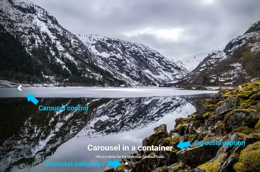
<img src="img/carousel1.jpg" class="img-fluid" alt="">
<div class="carousel-caption">
<h1>Carousel in a container</h1>
<p>This is a demo for the Bootstrap Carousel Guide.</p>
</div>
</div>
<div class="carousel-item">
<img src="img/carousel2.jpg" class="img-fluid" alt="">
</div>
<div class="carousel-item">
<img src="img/carousel3.jpg" class="img-fluid" alt="">
</div>
</div>
<!-- Controls -->
<a class="carousel-control-prev" href="#carousel-example-generic" role="button" data-slide="prev">
<span class="carousel-control-prev-icon" aria-hidden="true"></span>
<span class="sr-only">Previous</span>
</a>
<a class="carousel-control-next" href="#carousel-example-generic" role="button" data-slide="next">
<span class="carousel-control-next-icon" aria-hidden="true"></span>
<span class="sr-only">Next</span>
</a>
</div>
<h1>Some dummy demo content</h1>
<p class="lead"><strong>Pellentesque habitant morbi tristique</strong> senectus et netus et malesuada fames ac turpis egestas. Vestibulum tortor quam, feugiat vitae, ultricies eget, tempor sit amet, ante. Donec eu libero sit amet quam egestas semper. <em>Aenean ultricies mi vitae est.</em> Mauris placerat eleifend leo. Quisque sit amet est et sapien ullamcorper pharetra. Vestibulum erat wisi, condimentum sed, <code>commodo vitae</code>, ornare sit amet, wisi. Aenean fermentum, elit eget tincidunt condimentum, eros ipsum rutrum orci, sagittis tempus lacus enim ac dui. <a href="#">Donec non enim</a> in turpis pulvinar facilisis. Ut felis.</p>
<h2>Header Level 2</h2>
<ol>
<li>Lorem ipsum dolor sit amet, consectetuer adipiscing elit.</li>
<li>Aliquam tincidunt mauris eu risus.</li>
</ol>
<blockquote>
<p>Lorem ipsum dolor sit amet, consectetur adipiscing elit. Vivamus magna. Cras in mi at felis aliquet congue. Ut a est eget ligula molestie gravida. Curabitur massa. Donec eleifend, libero at sagittis mollis, tellus est malesuada tellus, at luctus turpis elit sit amet quam. Vivamus pretium ornare est.</p>
</blockquote>
<h3>Header Level 3</h3>
<ul>
<li>Lorem ipsum dolor sit amet, consectetuer adipiscing elit.</li>
<li>Aliquam tincidunt mauris eu risus.</li>
</ul>
</div>
<script src="https://code.jquery.com/jquery-3.3.1.slim.min.js" integrity="sha384-q8i/X+965DzO0rT7abK41JStQIAqVgRVzpbzo5smXKp4YfRvH+8abtTE1Pi6jizo" crossorigin="anonymous"></script>
<script src="https://cdnjs.cloudflare.com/ajax/libs/popper.js/1.14.3/umd/popper.min.js" integrity="sha384-ZMP7rVo3mIykV+2+9J3UJ46jBk0WLaUAdn689aCwoqbBJiSnjAK/l8WvCWPIPm49" crossorigin="anonymous"></script>
<script src="https://stackpath.bootstrapcdn.com/bootstrap/4.1.3/js/bootstrap.min.js" integrity="sha384-ChfqqxuZUCnJSK3+MXmPNIyE6ZbWh2IMqE241rYiqJxyMiZ6OW/JmZQ5stwEULTy" crossorigin="anonymous"></script>
</body>
</html>
Let's go through the code right now:
- we include Bootstrap's stylesheet and also Bootstrap minified JavaScript library, in our case both from MaxCDN
- Bootstrap's JS is dependent on jQuery and PopperJS, so we should not forget to include it too
- We will place the carousel to a Bootstrap
.container. As we want it to occupy the full width of the container, we don't need to use Bootstrap's.rownor.col-*classes.
Now, the carousel itself (main carousel element - div.carousel) consists of 3 parts:
ol.carousel-indicators(pagination-like navigation in the bottom of the carousel carousel)div.carousel-inner(in which we will place the content to be presented)- and two navigation links for the arrows -
a.carousel-control-prevanda.carousel-control-next.
Main carousel element
To tell Bootstrap to make a carousel from an element, just add class="carousel" and a specific id, in our case id="carousel-example-generic", to a <div>.
Notice, that we can pass options to the carousel via data attributes. In this case, we pass to it data-ride="carousel" that tells Bootstrap to autoplay the carousel. For the complete list of options, have a look here.
<div id="carousel-example-generic" class="carousel slide" data-ride="carousel">
...
</div>
Carousel indicators
This is an optional part of the carousel navigation coded in <ol class="carousel-indicators">.
Each carousel slide in .carousel-inner needs one <li> entry here.
Don't forget to add data-target attribute containing the carousel's id and data-slide-to attribute with the index of the slide it will be referring to (0 represents the first slide, 1 the second one, etc.).
The first <li> also should have class="active".
<li data-target="#carousel-example-generic" data-slide-to="0" class="active"></li>Carousel body
The main content of the carousel goes to <div class="carousel-inner">.
Wrap each of the slides to a <div class="carousel-item"> and mark the first item with an .active class too. The slide can contain an image or an image with a caption.
To create a caption, just place a <div class="carousel-caption"> with a text content into the slide.
<div class="carousel-inner" role="listbox">
    <div class="carousel-item active">
        <img src="img/carousel1.jpg" class="img-fluid" alt="">
        <div class="carousel-caption">
            <h1>Carousel in a container</h1>
            <p>This is a demo for the Bootstrap Carousel Guide by <a href="https://bootstrapious.com">Bootstrapious</a>.</p>
        </div>
    </div>
    ...
</div>
Carousel next and prev controls
For the next and previous arrow controls, you have to place two <a> elements into your carousel's code.
Notice again that the href attribute that should contain your carousel's id and the data-slide attributes with either prev or next values.
<!-- Controls -->
<a class="carousel-control-prev" href="#carousel-example-generic" role="button" data-slide="prev">
    <span class="carousel-control-prev-icon" aria-hidden="true"></span>
    <span class="sr-only">Previous</span>
</a>
<a class="carousel-control-next" href="#carousel-example-generic" role="button" data-slide="next">
    <span class="carousel-control-next-icon" aria-hidden="true"></span>
    <span class="sr-only">Next</span>
</a>
2. Options
From the previous part of this article, we should have a nice Bootstrap carousel. Now it is a great time to explore a bit its possible options.
The available options for the Bootstrap carousel are:
| Name | type | default | description |
|---|---|---|---|
| interval | number | 5000 | The amount of time to delay between automatically cycling an item. If false, the carousel will not automatically cycle. |
| pause | string | null | "hover" | If set to "hover", pauses the cycling of the carousel on mouseenter and resumes the cycling of the carousel on mouseleave. If set to null, hovering over the carousel won't pause it. |
| wrap | boolean | true | Whether the carousel should cycle continuously or have hard stops. |
| keyboard | boolean | true | Whether the carousel should react to keyboard events. |
Options can be passed via data attributes of the carousel element or via Javascript.
For configuring via data attributes, just prefix the option name with data- and use it on the carousel div.
<div id="carousel-example-generic" class="carousel slide" data-ride="carousel" data-interval="3000" data-pause="null">
    ...
</div>
Using JavaScript:
$('#carousel-example-generic').carousel({
  interval: 3000,
  pause: null
})
3. Modifying the default look and behaviour
Fullscreen carousel with vertically-centred captions
The first of the modifications I would like to show you is how to make a nice fullscreen intro section with a Bootstrap carousel.
CSS
The solution below sets the item height using vh units and will work in all modern browsers. In the carousel with a class="carousel-fullscreen", we set its slide height to 100vh (full height) and min-height to 600px (to have sufficient space for text on smaller devices).
/* carousel fullscreen */

.carousel-fullscreen .carousel-inner .item {
    height: 100vh;
    min-height: 600px;
    background-position: center center;
    background-repeat: no-repeat;
    background-size: cover;
}

/* carousel fullscreen - vertically centered caption*/

.carousel-fullscreen .carousel-caption {
    top: 50%;
    bottom: auto;
    -webkit-transform: translate(0, -50%);
    -ms-transform: translate(0, -50%);
    transform: translate(0, -50%);
}
HTML
In our HTML code, we need to change the markup a bit too. Instead of using the images in a <img> tag, we will use them as backgrounds for the slide's .carousel-item.
<div id="carousel-example-generic2" class="carousel slide carousel-fade carousel-fullscreen" data-ride="carousel">
    <!-- Indicators -->
    ...

    <!-- Wrapper for slides -->
    <div class="carousel-inner" role="listbox">
        <div class="carousel-item active" style="background-image: url('img/carousel1.jpg');">
            <div class="overlay"></div>
            <div class="carousel-caption">
                <h1 class="display-2 font-weight-bold">Bootstrap Carousel Guide</h1>
                <p class="h4 font-weight-light">This is a demo for the <a href="https://bootstrapious.com/p/bootstrap-carousel" class="text-white">Bootstrap Carousel Guide</a> by <a href="https://bootstrapious.com" class="text-white">Bootstrapious.com</a>.</p>
            </div>
        </div>
        <div class="carousel-item" style="background-image: url('img/carousel2.jpg');">
          ...
        </div>
        <div class="carousel-item" style="background-image: url('img/carousel3.jpg');">
            ...
        </div>
    </div>

    <!-- Controls -->
    ...
</div>
Transparent overlay
Sometimes, you will need to darken the image to increase the contrast between the text and the background image. The solution is very simple, we will add just one more additional <div> to carousel's <div class="item">.
CSS
/* overlay for better readibility of the caption */

.overlay {
    position: absolute;
    width: 100%;
    height: 100%;
    background: #000;
    opacity: 0.3;
    transition: all 0.2s ease-out;
}
HTML
<div class="item">
    <div class="overlay"></div>
    <div class="carousel-caption">
        ...
    </div>
</div>
Fade transition instead of sliding
To change the transition between slides to fade instead of sliding, all you need to do in Bootstrap 4 is to add .carousel-fade class to your carousel.
The complete list of classes for the basic carousel would be class="carousel slide carousel-fade".
Change transition duration
The default duration of a slide transition is set to 0.6s. That might be a quick, especially when using the fade transition. To adjust the duration of the transition between the slides, add this definition into the CSS file. (in our case custom.css)
.carousel .carousel-item {
    transition-duration: 1.5s;
}
Add touch and swipe support for the carousel
One of the biggest disadvantages of using Bootstrap 4 carousel is its lack of swipe and touch support.
Luckily, it is not a complicated thing to add this behaviour with jQuery.
To enable the touch and swipe support, add this snippet to a separate JS file or just inside the <script></script> block just before the end </body> tag.
This tweak is based on one of the SO's answers.
var touchSensitivity = 5;
$(".carousel").on("touchstart", function (event) {
    var xClick = event.originalEvent.touches[0].pageX;
    $(this).one("touchmove", function (event) {
        var xMove = event.originalEvent.touches[0].pageX;
        if (Math.floor(xClick - xMove) > touchSensitivity) {
            $(this).carousel('next');
        } else if (Math.floor(xClick - xMove) < -(touchSensitivity)) {
            $(this).carousel('prev');
        }
    });
    $(".carousel").on("touchend", function () {
        $(this).off("touchmove");
    });
});
Demo
Have a look at the online demo featuring all these carousel upgrades.
Bootstrap 3
Differences between Bootstrap 4 and Bootstrap 3
The good news is that there are only a few differences in the HTML code of the carousels in Bootstrap 4 and Bootstrap 3.
- items: .carousel-item (B4) = .item (B3)
- fade transition: you have to code the fade transition in Bootstrap 3 yourselves (see my code below),
- pagination: rectangles (B4) vs circles (B3)
Fade effect between the slides
To have the fade effect between the slides is not so straightforward in Bootstrap 3. We need to change the transition from default transform transition to an opacity transition.
This solution was published originally in this Codepen.
CSS
/* original solution by https://codepen.io/Rowno/pen/Afykb */

.carousel-fade .carousel-inner .item {
    -webkit-transition-property: opacity;
    transition-property: opacity;
}
.carousel-fade .carousel-inner .item, .carousel-fade .carousel-inner .active.left, .carousel-fade .carousel-inner .active.right {
    opacity: 0;
}
.carousel-fade .carousel-inner .active, .carousel-fade .carousel-inner .next.left, .carousel-fade .carousel-inner .prev.right {
    opacity: 1;
}
.carousel-fade .carousel-inner .next, .carousel-fade .carousel-inner .prev, .carousel-fade .carousel-inner .active.left, .carousel-fade .carousel-inner .active.right {
    left: 0;
    -webkit-transform: translate3d(0, 0, 0);
    transform: translate3d(0, 0, 0);
}
.carousel-fade .carousel-control {
    z-index: 2;
}
HTML
To use the fade effect, just add class="carouse-fade" to your carousel.
<div id="carousel-example-generic2" class="carousel slide carousel-fade">
   ...
</div>
Useful links
- Bootstrap 4 Carousel official documentation
- Bootstrap 3 Carousel official documentation
- Unsplash - thank you for the beautiful images for the demos
Have a look at my other tutorials. You could like the tutorials on making a working contact form or creating lightweight share icons for your website.