How to make a modern website for your business
It's no doubt that business technology is progressing at a remarkable pace. With countless new solutions popping up by the minute, it's only crucial to stay over the top with your website design. The importance of having a modern website cannot be overstated. A visually pleasing website and easy-to-update features are only some benefits of this design.
Fortunately, creating a modern website is pretty easy! It all boils down to making a positive user experience for your customers. From a business perspective, you should create a compelling and easy-to-navigate site, so your company stands out.
With the following steps, you can create a modern website that helps grow your business immensely.
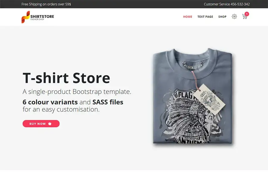
Full-page Headers
The header is the first thing users see when they visit your website! It sets the whole tone of your site. Good header design provides all the necessary information where users expect to see it, so it's safe to say that header design is essential.
While the use of full-page headers has been since websites were created, it is only since the rise in mobile use that this trend took off. There is still a mix of sizes, but more designers take tips from old newspaper designs and create more prominent visuals.
A good design serves more than just menus, though. Full-page headers are also helpful in creating brand consistency across multiple website pages. Since you only have a few seconds to get a message across, you can emphasize the creative impact of your header and generate users' interest tenfold.
Mobile-friendly Design
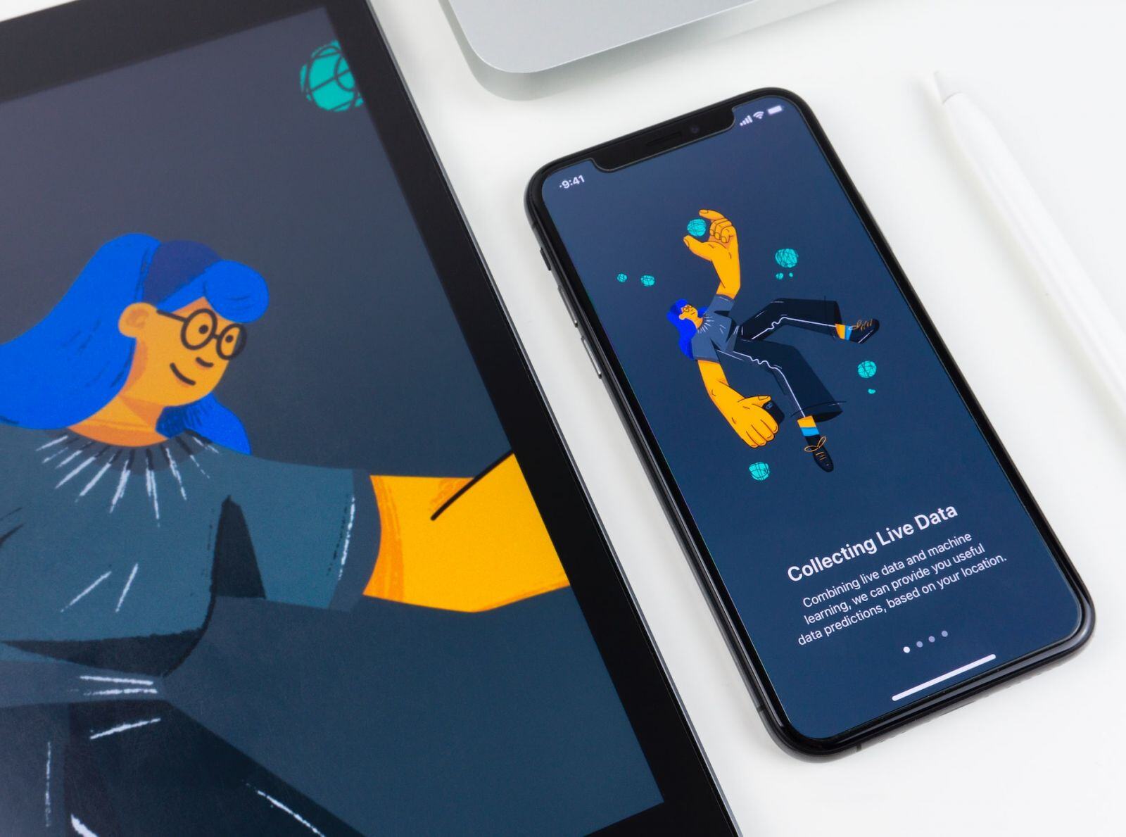
As an owner, you want your website to reach as many people as possible. Essentially, you also want it to be responsive. A website that doesn't do any of these things will have trouble ranking in Google and annoy many users.
In other words, people's access to the internet has moved from 100% desktop devices to hand-held devices. Your site should have an optimized user interface on a phone or hand-held device. It would also have an easy-to-read layout and size of all the various elements on a web page to make it easier for your users to understand.
High-quality Imagery
You can only complete a brand identity with the proper visual elements. This includes the images you use on your website and social media outlets.
Imagery can consist of various elements, including photography, animations, and icons. Typically, you'll use your images with other essential design elements, such as color schemes and typography. The goal is to use appropriate images that suit your company's theme.
And also, make sure your site feels right when browsing. Add a few page transitions but not too many.
Grid Design
Grids are considered one of the most fundamental staples in a designer's toolbox. While every designer has their reason why grids are essential, the basic idea behind a grid-based design is to structure your design in a way that would otherwise be difficult.
Using grids, you can create a unified look across your site pages, no matter what device users view it on. This quickly makes your website more responsive and improves site navigation tenfold. What's more, you create a neat, clean, and organized layout by doing this.
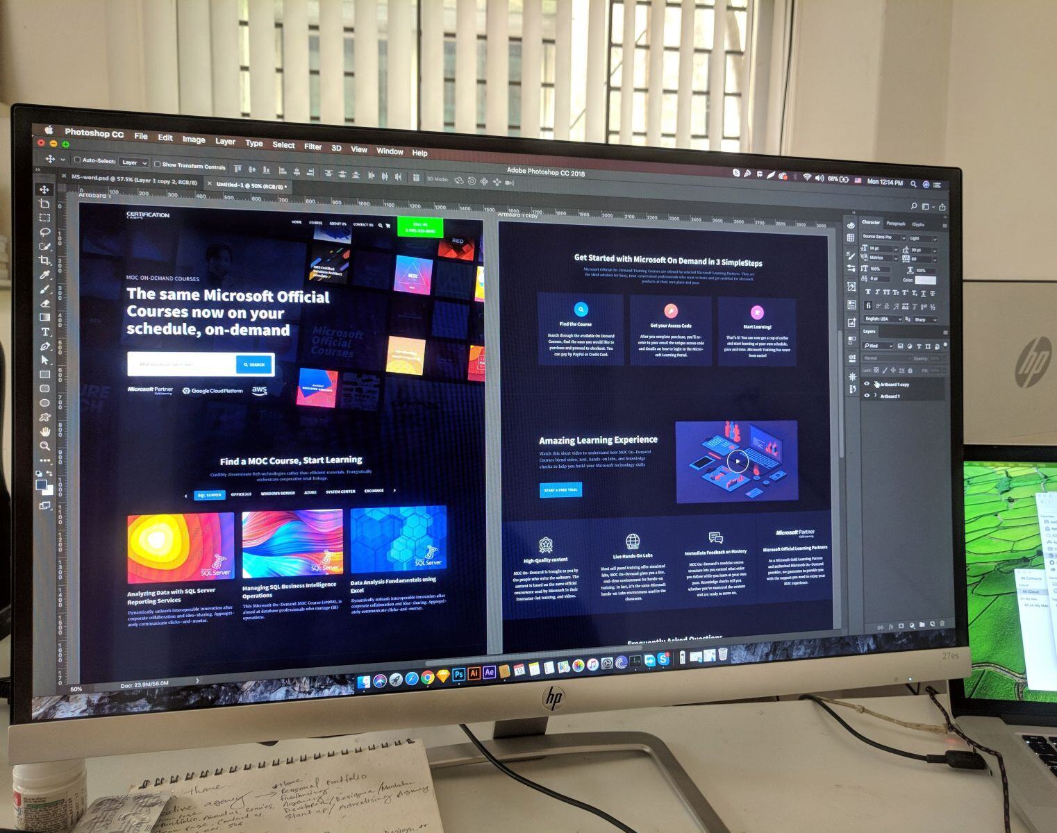
SVG graphics
SVG or Scalable vector graphics play an integral role in website design today. This graphic is a popular tool for displaying pictures, charts, and illustrations on websites. Plus, as a vector file, it can be scaled up or down without compromising the quality.
This is especially helpful when creating websites that look good and work well across various devices and screens. Generally, SVG has a smoother appearance than images of other formats, which makes them the ideal fit for your website’s design.
Speed Optimization
Speed plays a vital role in deciding how audiences perceive your brand! According to studies, 47% of people don’t wait more than two seconds for a page to load. After all, it is human tendency to prefer a faster, more reliable, and more professional website. In contrast, a slow website is designed to annoy users.
Designers strive hard to make content aesthetically pleasing and functional by adding numerous features and content. However, if these features are not adequately optimized, it can affect your website’s speed and user experience.
Focus on UX/UI
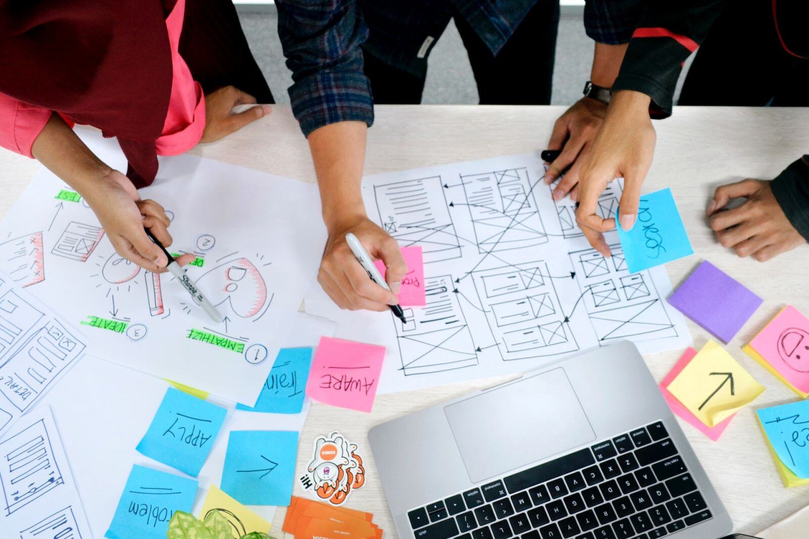
A common mistake many designers make is only focusing on the visual design of a website. This no longer plays to our advantage, as more is needed to create a practical user experience. Instead, in this time and era, we need to start paying more attention to user interface and usability.
The UX/UI design can ultimately help you win your customer's confidence if the website provides them with what they're looking for!
White space
Many elements form the layout and structure of an interactive design but often leave out the most vital one—white space. Unlike visual methods, white space is invisible. In essence, white space is the space surrounding and between the content of a design. It's essentially everything that isn't the content.
Let's face it, users are always in a hurry when browsing through sites, and having a good amount of white space allows for increased interaction by preventing unwanted distractions.
You can incorporate white space in many ways, but the most popular way is to make your images bigger and add white space around them. This way, visitors can see more of your content in case you have a lot of text-heavy pages!
Color
Remember the color when considering a minimal design for your business's website. Choosing the right color palette and scheme is one of website design's most essential and overlooked aspects.
When designing your site, you should make intelligent decisions based on the psychology of color. This makes it essential for stakeholders to forgo gut feelings as the choice of color will impact your overall brand image. With the right colors and contrasts, users can better understand the information they're viewing.
Dynamic scrolling
If you want your website to look more interactive, dynamic scrolling is what can help you implement it successfully. It is easily one of the most popular design trends, and for a good reason. This tactic occurs when the background image of your site moves at a different speed than the foreground image, creating an impressive 3D effect for web visitors.
What's more, you put your visitors in charge of dynamic scrolling. By doing so, they take an active part in their interaction with your site. This is a great way to give people the impression that they choose to engage with your site, making them more positive and more opt for your message.
Conclusion
Although excellent web design practices have come a long way, there's still something about a visually pleasing website that pulls in more customers. With these steps in mind, your business can achieve a modern, sleek look that will help them stand out.

